Brief
What is “Camps for kids”?
"Camps for Kids" is a mobile app for Android, which stands for helping parents (mostly Moms) about researching for the kids’ camps in an easy way, handled by the phone. Users are encouraged to search, filter & sort camps, save them to collections by adding notes and add friends to chat and see their camp traveling plans and reviews.
What makes “Camps for kids” unique?
A one-stop source for camps search. No analog exists yet.
Roles & Responsibilities
UI/UX Designer, UX Researcher
Problem:
Parents are struggling to find out which camp is the best fit for their children.
What is on the market? Where mom is going to look at first?
I set up a survey to find out their first impression of how do mom starts the research on that point. 33 potential users participated in the survey and brought this data:
The hardest is to gain the first time experience
During the search for a camp on the web, there is no one-stop source
If parents will look for the camps on the web sources only, they will get confused a lot! Everything is unclear, websites are not sorted, sources are very different. I may assume, that at this point parents start to use additional sources of info.
For example, if we may looking for kid camps on East Coast, we may find only those 3 sources, but according to the Heuristic evaluation report, they are limited…
The user tries to talk to friends, search local ads to replace the missing web experience.
After conducting 5 1:1 interviews with the target audience, I sum up findings into an affinity map. Also, I synthesized research and built an Empathy map, User Journey Map and Persona. All of these methodologies helped to brainstorm ideas for HMW questions.
Interviewees quotes:
“It was hard to find a good camp referral”
- User 03
I cannot rely on Google reviews only, I have to know in person
- User 01
I do not rush with my search, I am finding out details during the year.
- User 02
My kids want to get into the same camp their friends went last year
- User 05
Creating a Persona
as a synthesis of the observations and analysis, I’ve got recorded from many different users. That helped me to align with one character.
Ideation phase - “going wide” in terms of concepts and outcomes
Brainstorming solution: I used mash up method combining Instagram social network and Yelp reviews network. Answering on HMW questions trying to get trustworthy and social friendly experience.
What we may take from Instagram as a social network: Alice may know who’s reviews she can rely on? She may make new friends and chat add other mom to a friends list and she can chat with her.
What we may take from Yelp as a search source: Alice can sort her search, see related camps, bookmark her search
A piece from Google guide: Alice may connect with new friends relying on each mom rate for reviews
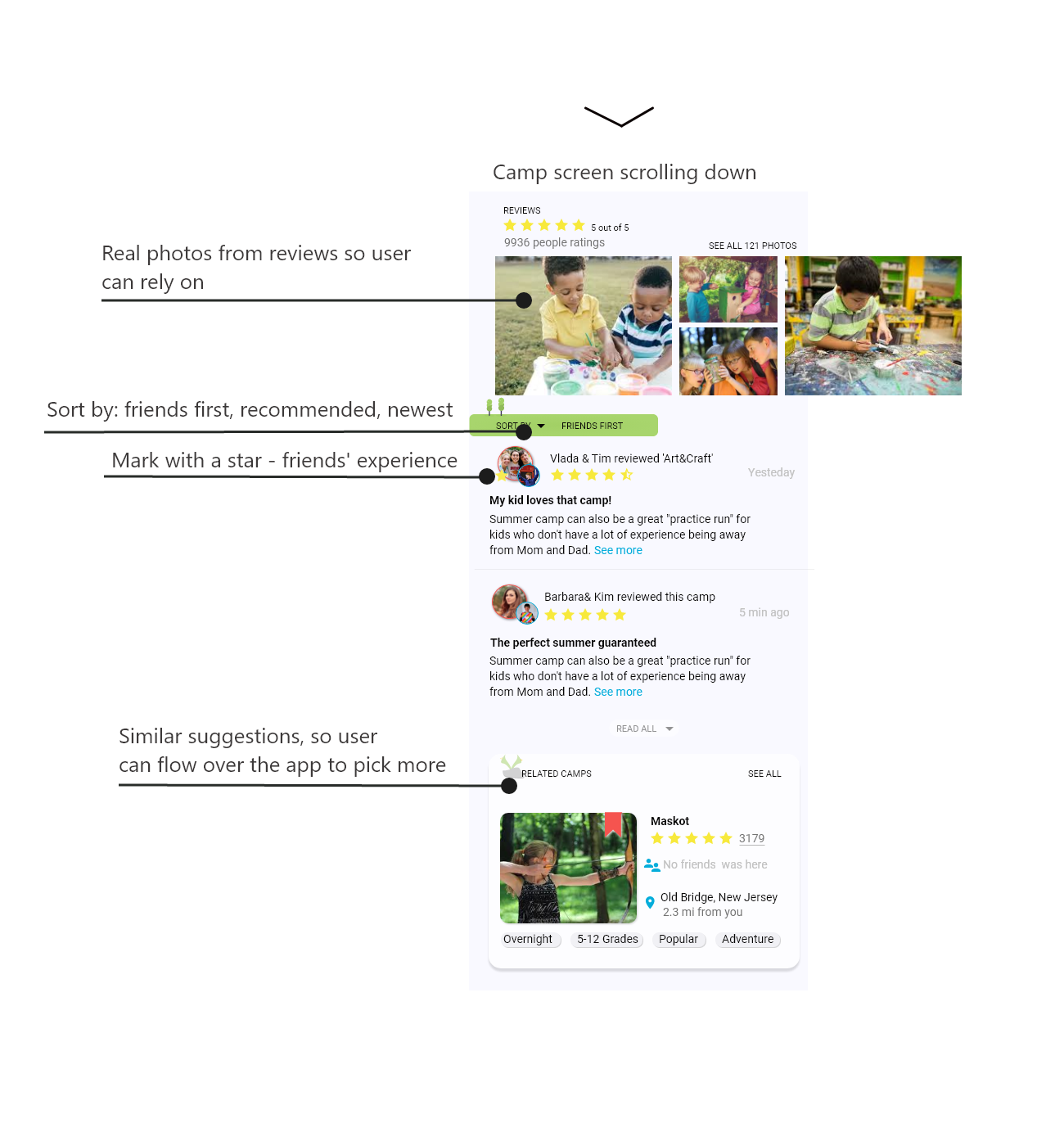
Innovations: Plans can be shared with favorite friends, friends’ reviews are seen at first, Alice can add a review in the name of the kid
How Alice will use the product?
What features Alice may need? Answering this question with identifying Alice's needs I built up user stories and identified common touchpoints assign them as MVP each type of Mom’s search preferences may use. MVP helped me to quickly test the product.
Lo-fi prototype and Guerilla testing
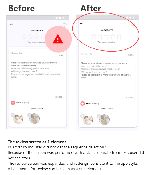
Following given information architecture and finding the Red Routes, I did paper sketches for 20 screens. Usability testing was performed with 5 participants, 15 minutes each. It was one of the key parts of the design phase because it was done quickly and new improved user flows were formed.
My goal was to validate components placement and accessibility of each feature.
Key findings
I found out that people who get used to popular mass apps like the ‘Amazon’ app are looking for related experience and suggestions.
People who are used to ‘Yelp’ find ‘Camps for kids’ app very easy to use.
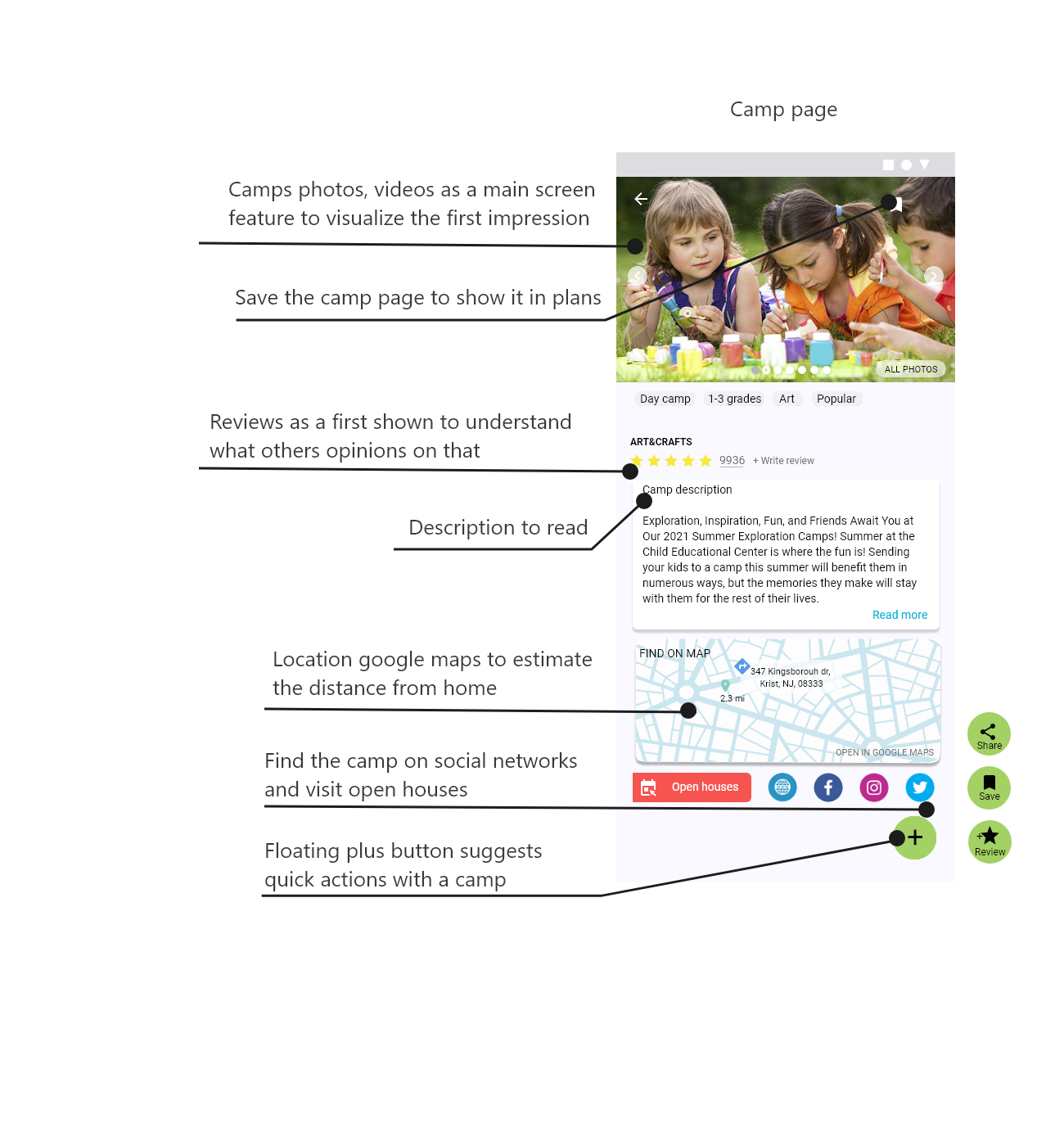
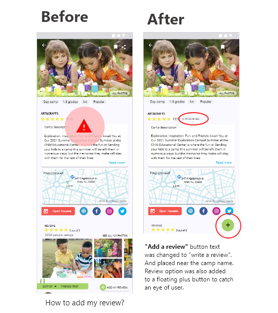
Participants wanted to search for a camp name and review it from its page, right away.
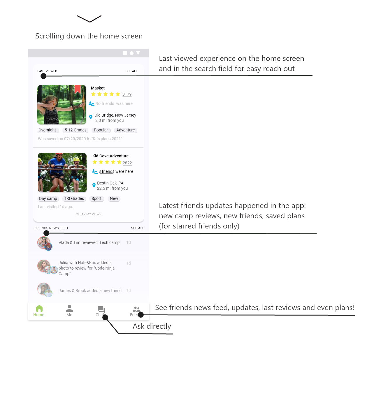
Location search, related search, and last viewed must be seen.
Recommendations
Add a camp page for the review because it is the most way all persons were looking for - to review from the camp page.
Pay more attention to the related experience and last viewed camps in the search field.
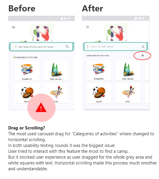
Expand search field with options for search: locally, last viewed plus typo suggestions
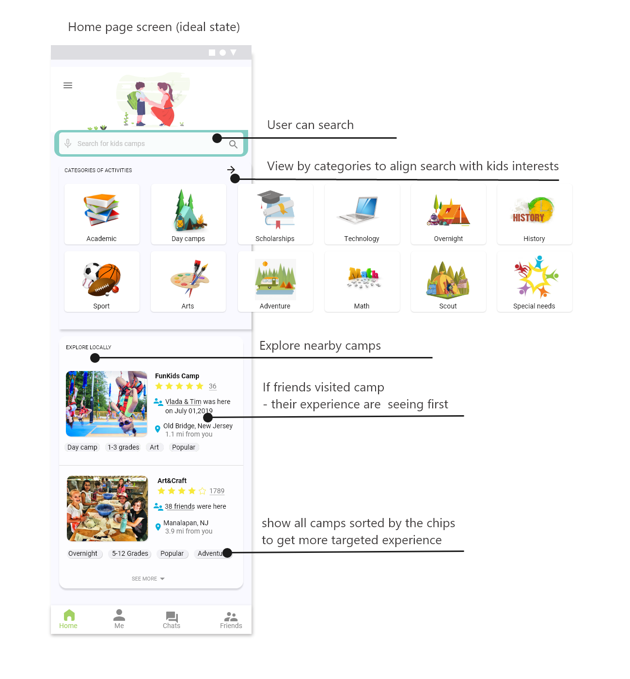
User interactions for each key exploring moment, helped me to identify features for the home screen
Alice will have many different ways to research for a camp, relying on her and her kids friends’ experience, explore near by or last reviewed camps, most popular, top and others sort & filter options.
In her profile Alice is also able to save her search or share it as “a plan“ with friends.
“Camps for kids” style guide tend to communicate a sense of playfulness, openness, informality
The app will combine a social network and searching source, that should help each Mom to make the research for a camp process much easier: log in and see what camps she can get for her kids in a trustworthy and easy way. We provide modern tools that make it easy for each parent to research and make a decision which camp will be the best fit.
How user stories considered important and perform for features:
Usability testing with 10 different users from target audience led to key results for the final prototype.
First variation of clickable prototype - the way to identify aspects of the product that could be improved and ensure that “Camps for kids” meets the needs of users.
Measure UX Effectiveness
93% is the task success rate for 2 round usability tests;
4 of 5 users agreed that the navigation icons are easy to interpret and the color palette and fonts are nice, simple, and not distracting to the content;
NPS for how would you recommend the app to your friend or colleague is 90%.
Results and impact:
‘Camps for kids” - is a Bootcamp project, but I am still keeping in mind, that when I will have more time and experience I will learn the way how I can put it on the Kickstarter :) I continue to show my work to my friends and they are inspired by it. The more tools mom may have to figure out such life moments of “How to pick the right thing, how to find it, where to look it for?” the happier she will be, and how we all know: “Happy Mom = Happy Kids“
Lessons learned:
“You cannot walk a mile in someone’s shoes until you take your own shoes off”
Scott Cook co-founder of Intuit
First experience
This, being my first project, was an enormous learning experience. I found it extremely exciting and stimulating to solve a problem that stemmed from my friend’s experience. Having said that, I realized that the above quote is the gospel. User research was a key to building this app and everything traced back to it.
Empathize and work on it
It’s always not enough to understand human psychology and behavior, but we have to learn and improve this skill to great empathize UX designers. It was a challenge for me to get insights from interviews divided into parts: think, feel, say, do. Because participants talking was so much different at the first look, only after I finished the empathy map I realized they were talking all about the same.
Always do more than 1 option to interact with the flow
Here I mean, that’s the best practice in design will be to give the user more options to choose from how he can get through the flow smoothly and easily. When I did only one way to find the camp through the search only, I thought it was easy, but the user showed me it was difficult as they continue to keep in mind that they were just new in the app and do not have anything to look like a last viewed, so they have to get more ways how to interact during the researching and designing processes.


